geom_tile [heatmap]
https://ggplot2.tidyverse.org/reference/geom_tile.html
https://www.r-graph-gallery.com/heatmap
https://stagraph.com/HowTo/Plot/Geometries/Geom/tile
geom_tile, geom_rect, geom_raster
geom_tile 과 geom_rect는 같은데 파라미터가 다르다.
– geom_tile()은 tile의 중심과 크기를 사용하고, (x,y,width, height)
– geom_rect()는 tile의 모서리4개의 위치로 (xmin, xmax, ymin, ymax) 를 사용한다.
geom_raster()는 tile의 크기가 같을때, 성능이 좋은 geom_tile과 같다.
cf) geom_contour()
geom_tile(mapping=NULL, data=NULL, stat="identity", position="identity", ...,
         linejoin = "mitre",
         na.rm = FALSE, show.legend = NA, inherit.aes = TRUE)

geom_raster(mapping=NULL, data=NULL, stat="identity",  position="identity", ...,
         hjust = 0.5, vjust = 0.5, interpolate = FALSE,
         na.rm = FALSE,   show.legend = NA,  inherit.aes = TRUE)
dd <- data.table(faithfuld)
names(dd) <- c("eruptions","waiting","dens")
# A tibble: 5,625 x 3
# eruptions waiting density
#
#1     1.6       43 0.00322
#2     1.65      43 0.00384
#3     1.69      43 0.00444
# ...
p <- dd %>% ggplot(aes(x=waiting, y=eruptions)) + geom_tile(aes(fill=dens))
ggplotly(p)
dd %>% ggplot(aes(x=waiting, y=eruptions)) + geom_raster(aes(fill=dens))

dt <- data.table(
  time  = rep(c(2, 5, 7, 9, 12), 2),
  cycle = rep(c(1, 2), each = 5),
  score = factor(rep(1:5, each = 2)),
  wide = rep(diff(c(0, 4, 6, 8, 10, 14)), 2)
)
#     time cycle score wide
#  1:    2     1     1    4
#  2:    5     1     1    2
#  3:    7     1     2    2
#  4:    9     1     2    2
#  5:   12     1     3    4
#  6:    2     2     3    4
#  7:    5     2     4    2
#  8:    7     2     4    2
#  9:    9     2     5    2
# 10:   12     2     5    4
stheme = scale_x_discrete(limits=c(1:12))

dt %>% ggplot(aes(x=time, y=cycle)) + geom_tile(aes(fill=score)) + stheme
dt %>% ggplot(aes(x=time, y=cycle)) + geom_tile(aes(fill=score), color="grey50") + stheme
dt %>% ggplot(aes(x=time, y=cycle, width=wide)) + geom_tile(aes(fill=score), color="grey50") + stheme
dt %>% ggplot(aes(xmin=time-wide/2, xmax=time+wide/2, ymin=cycle, ymax=cycle+1)) + geom_rect(aes(fill=score), color="red") + stheme

set.seed(666)
df <- expand.grid(x=0:5, y=0:5)
df$z <- runif(nrow(df))
df
#    x y             z
# 1  0 0 0.77436849033
# 2  1 0 0.19722419139
# 3  2 0 0.97801384423
...
# 36 5 5 0.49425172131
df %>% ggplot(aes(x,y)) + geom_tile(aes(fill=z))
df %>% ggplot(aes(x,y)) + geom_raster(aes(fill=z))
df %>% ggplot(aes(x,y)) + geom_raster(aes(fill=z), hjust=0, vjust=0)  # zero padding

mtcars %>% ggplot(aes(x=mpg, y=factor(cyl))) + geom_point()
mtcars %>% ggplot(aes(x=mpg, y=factor(cyl))) + stat_bin2d(aes(fill=stat(count)))
mtcars %>% ggplot(aes(x=mpg, y=factor(cyl))) + stat_bin2d(aes(fill=stat(count)), binwidth=c(3,1) )
mtcars %>% ggplot(aes(x=mpg, y=factor(cyl))) + stat_bin2d(aes(fill=stat(density)))
mtcars %>% ggplot(aes(x=mpg, y=factor(cyl))) + stat_bin2d(aes(fill=stat(density)), binwidth=c(3,1))
mtcars %>% ggplot(aes(x=mpg, y=factor(cyl))) + stat_density(aes(fill=stat(density)), geom="raster")
mtcars %>% ggplot(aes(x=mpg, y=factor(cyl))) + stat_density(aes(fill=stat(count)), geom="raster", position="identity")
mtcars %>% ggplot(aes(x=mpg, y=factor(cyl))) + stat_density(aes(fill=stat(density)), geom="raster", position="identity")
spinrates <- read.csv("https://raw.githubusercontent.com/plotly/datasets/master/spinrates.csv", stringsAsFactors=F)
spinrates %>% str
spinrates %>% ggplot(aes(x=velocity, y=spinrate)) + geom_point()

p <- spinrates %>% ggplot(aes(x=velocity, y=spinrate)) + geom_tile(aes(fill=swing_miss))
p <- p + scale_fill_distiller(palette="YlGnBu", direction=1) +
          theme_light() + labs(title = "Likelihood of swinging and missing on a fastball", y="spin rate (rpm)")
ggplotly(p)

# Create a shareable link to your chart
# Set up API credentials: https://plot.ly/r/getting-started
chart_link = api_create(p, filename="geom_tile/customize-theme")
chart_link
ex
nba <- read.csv("http://datasets.flowingdata.com/ppg2008.csv") %>% data.table
#The players are ordered by points scored, and the Name variable converted to a factor that ensures proper sorting of the plot.
nba$Name <- with(nba, reorder(Name, PTS))
nba.m <- melt.data.table(nba, id.vars = c("Name") )
dd <- split(nba.m, nba.m$variable) %>% map_df(function(x) x[, rescales:=scales::rescale(value)])


p <- nba.m %>% ggplot(aes(x=as.factor(variable),y= Name)) + geom_tile(aes(fill = value) , colour = "white") #+
  #scale_fill_gradient(low = "white" , high = "steelblue")
p


p <- dd %>% ggplot(aes(x=as.factor(variable),y= Name)) + geom_tile(aes(fill = rescales) , colour = "white") +
  scale_fill_gradient(low = "white" , high = "steelblue")
p

base_size <- 9
p + hrbrthemes::theme_ipsum(base_size = base_size) +
  labs(x = "",y = "") +
  scale_x_discrete(expand = c(0, 0)) + scale_y_discrete(expand = c(0, 0)) +
  theme(legend.position="none",
       axis.ticks = element_blank(),
       axis.text.x = element_text(size=base_size*0.8, angle=330, hjust=0))


# heatmap-function uses a different scaling method and
# therefore the plots are not identical.
# Below is an updated version of the heatmap which looks much more similar to the original.
ex
http://www.sthda.com/english/wiki/ggplot2-quick-correlation-matrix-heatmap-r-software-and-data-visualization
# Prepare the data
mydata <- mtcars[, c(1,3,4,5,6,7)]
mydata %>% head()
# Compute the correlation matrix
cormat <- round(cor(mydata),2)
cormat %>% head()

cormat %>% rownames()
cormat %>% colnames()

cormat_m <- melt(cormat) %>% data.table()
cormat_m %>% head()
# draw heatmap
cormat_m %>% ggplot(aes(x=Var1, y=Var2)) + geom_tile(aes(fill=value))

# Get lower triangle of the correlation matrix
get_lower_tri<-function(cormat){
  cormat[upper.tri(cormat)] <- NA
  return(cormat)
}
# Get upper triangle of the correlation matrix
get_upper_tri <- function(cormat){
  cormat[lower.tri(cormat)]<- NA
  return(cormat)
}

upper_tri <- get_upper_tri(cormat)
upper_tri

melted_cormat <- melt(upper_tri, na.rm=T)
# Heatmap
p <- melted_cormat %>% ggplot(aes(Var2, Var1)) + geom_tile(aes(fill=value), color="white")
p
p + scale_fill_gradient2(low="blue", high="red", mid="white",
                       midpoint=0, limit=c(-1,1), space="Lab",
                       name="Pearson\
Correlation") +
  theme_ipsum(base_size=9) + coord_fixed() +
  theme(axis.text.x = element_text(angle=45, vjust=1, size=12, hjust=1))
p

# Reorder the correlation matrix
reorder_cormat <- function(cormat){
  # Use correlation between variables as distance
  dd <- as.dist((1-cormat)/2)
  hc <- hclust(dd)
  cormat <-cormat[hc$order, hc$order]
}

cormat <- reorder_cormat(cormat)
upper_tri <- get_upper_tri(cormat)
# Melt the correlation matrix
melted_cormat <- melt(upper_tri, na.rm=T)
# Create a ggheatmap
p <- melted_cormat %>% ggplot(aes(Var2, Var1)) + geom_tile(aes(fill=value), color="white")
p <- p + scale_fill_gradient2(low="blue", high="red", mid="white",
                         midpoint=0, limit=c(-1,1), space="Lab",
                         name="Pearson\
Correlation") +
  theme_ipsum(base_size=9) + coord_fixed() +
  theme(axis.text.x = element_text(angle=45, vjust=1, size=12, hjust=1))
p

# Add correlation coefficients on the heatmap
p + geom_text(aes(Var2, Var1, label=value), color="black", size=4) +
  theme(
    axis.title.x     = element_blank(),
    axis.title.y     = element_blank(),
    panel.grid.major = element_blank(),
    panel.border     = element_blank(),
    panel.background = element_blank(),
    axis.ticks       = element_blank(),
    legend.justification = c(1, 0),
    legend.position      = c(.4,.8),
    legend.direction     = "horizontal") +
  guides(fill=guide_colorbar(barwidth=7, barheight=1,
                             title.position="top", title.hjust=0.5))
ex
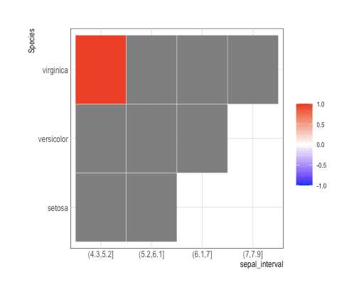
myIris <- iris %>% data.table() %>%
  mutate(sepal_interval=cut(Sepal.Length, 4)) %>%
  group_by(sepal_interval, Species) %>% summarise(n_obs=n())

myIris%>% ggplot(aes(x=sepal_interval, y=Species, fill=n_obs)) +
 geom_tile(color="white") +
 scale_fill_gradient2(midpoint=0,limit=c(-1,1),name="",
                      low="blue",mid="white",high="red")
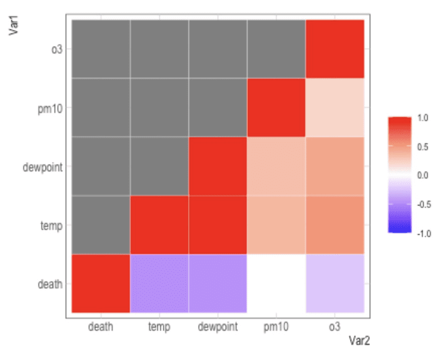
nmmaps<-fread("https://raw.githubusercontent.com/Z3tt/R-Tutorials/master/ggplot2/chicago-nmmaps.csv")
thecor<-cor(nmmaps[,c("death", "temp", "dewpoint", "pm10", "o3")],
\t\t\tmethod="pearson", use="pairwise.complete.obs") %>% round(2)
thecor[lower.tri(thecor)]<-NA

melt(thecor) %>% ggplot(aes(Var2, Var1)) +
 geom_tile(aes(fill=value), color="white") +
 scale_fill_gradient2(midpoint=0,limit=c(-1,1),name="",
                      low="blue",mid="white",high="red") +
 coord_equal()