histogram
| Histogram | Bar graph (stat = “count”) | Bar graph (stat = “identity”) | |
| type of data | 연속형 (numerical data) int, number | 이산형 (categorical data) factor | Frequency Table |
| X | X | X, Y | |
| indicate | 분포 | 비교 | 표시 |
| elements | 범위에 따라 grouping | 각 bin를 이룬다. | 각 bin는 y값 |
| reorder | 불가능 | 가능 | 가능 |
| bar width | 같을 필요없다. | 항상 같다. | 항상 같다. |
bins vs. binwidth
한 변수(X)의 구간별 빈도수를 나타낸 그래프
구간은 일반적으로 등간격으로 나누기 때문에, 구간의 넓이/폭/interval (or 갯수)가 중요하다.
– bins : 표현할 막대 갯수
– binwidth: 막대를 나누는 단위 기준
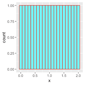
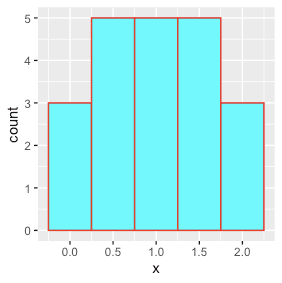
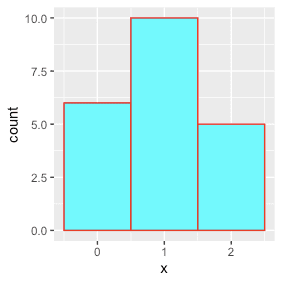
bins : 표현할 막대 갯수
dd <- data.table(x = seq(0,2,by=0.1))  # 0.0, 0.1, 0,2, ..... 1.9, 2.0  행21개, 열1개 dt.
dd %>% ggplot(aes(x)) + geom_histogram(fill="cyan", color="red")
# Bins
dd %>% ggplot(aes(x)) + geom_histogram(bins=21, fill="cyan", color="red")
dd %>% ggplot(aes(x)) + geom_histogram(bins=5,  fill="cyan", color="red")
dd %>% ggplot(aes(x)) + geom_histogram(bins=3,  fill="cyan", color="red")
binwidth: 막대를 나누는 단위 기준
dd <- data.table(x = seq(0,2,by=0.1))  # 0.0, 0.1, 0,2, ..... 1.9, 2.0  행21개, 열1개 dt.
# Binwidth
dd %>% ggplot(aes(x))+ geom_histogram(binwidth=0.1, fill="cyan", color="red")
dd %>% ggplot(aes(x))+ geom_histogram(binwidth=0.5, fill="cyan", color="red")
dd %>% ggplot(aes(x))+ geom_histogram(binwidth=1,   fill="cyan", color="red")
0.8~1.0~1.2
1.3~1.5~1.7
1.8~2.0
0.6~1~1.5
1.5~2~
geom_histogram
geom_freqpoly(stat="bin", position="identity", ..., )

geom_histogram(stat="bin", position="stack", ...,
                binwidth=NULL, bins=NULL,)
      stat_bin(geom="bar", position="stack", ...,
                binwidth=NULL, bins=NULL,
                center=NULL, boundary=NULL, breaks=NULL, closed=c("right","left"), pad=FALSE,
                na.rm=FALSE, show.legend=NA, inherit.aes=TRUE)
등간격이 밑면이 1일때, 각 bin의 높이는 비율.
counts/ (n*diff(breaks))
dd <- fread("http://assets.datacamp.com/blog_assets/chol.txt")
#dd <- read.table("http://assets.datacamp.com/blog_assets/chol.txt", header=T) %>% data.table

dd %>% ggplot(aes(x=AGE)) + geom_histogram()
dd %>% ggplot(aes(x=AGE, fill=..count..)) + geom_histogram(bins=41)
dd %>% ggplot(aes(x=AGE, fill=..count..)) + geom_histogram(binwidth=1)

dd %>% ggplot(aes(x=AGE)) + geom_histogram(stat="bin", position="stack")
dd %>% ggplot(aes(x=AGE)) + stat_bin(aes(fill=stat(count)))
dd %>% ggplot(aes(x=AGE)) + stat_bin(aes(fill=))
dd %>% ggplot(aes(x=AGE)) + stat_bin(aes(fill=..ncount..))
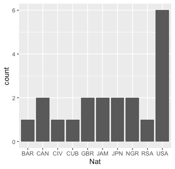
예제데이터 (100m달리기 선수 기록, 2019년)
library("rvest")
URL="https://www.iaaf.org/records/toplists/sprints/100-metres/outdoor/men/senior/2019"
runner <- URL %>% read_html() %>% html_table()
runner <- runner[[3]] %>% data.table()
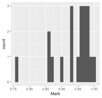
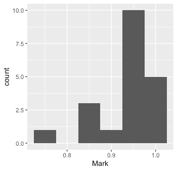
top20 <- runner[1:20, .(Competitor, Nat, Mark=(Mark-9))]
top20 %>% ggplot(aes(x=Mark)) +
            geom_histogram(binwidth=0.01)
top20 %>% ggplot(aes(x=Nat)) +
            geom_bar()
위에서 (9초를 기준으로) 선수 0.01초 간격으로 histogram을 그렸다.
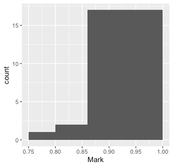
bar와 다르게 histgram은 0.05초 기준으로 그려볼 수 도 있고, 각 bin의 넓이를 다르게 지정할 수도 있다.
top20 %>% ggplot(aes(x=Mark)) +
  geom_histogram(binwidth=0.05)
top20 %>% ggplot(aes(x=Mark)) +
  geom_histogram(breaks=c(0.75,0.80, 0.86, 1))
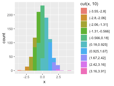
color with cut()
https://www.r-bloggers.com/pretty-histograms-with-ggplot2/
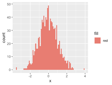
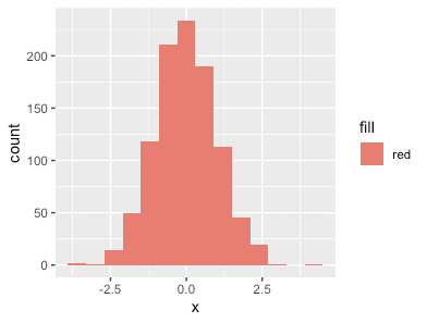
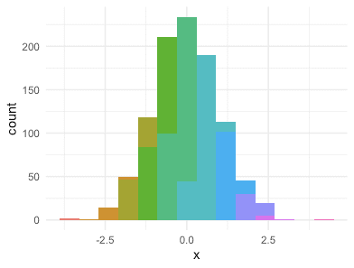
dd <- data.table(x=rnorm(1000))

dd %>% ggplot(aes(x, fill="red")) + geom_histogram(binwidth=.1)

dd %>% ggplot(aes(x, fill=cut(x, 10))) + geom_histogram(binwidth=.6)
dd %>% ggplot(aes(x, fill=cut(x, 10))) + geom_histogram(binwidth=.6) +
         theme_minimal() + theme(legend.position='none')
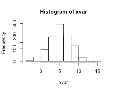
xvar <- rnorm(n=1000, mean=5, sd=3)
dd <- data.table(xvar)
xvar_mean <- mean(xvar)
dd %>% ggplot(aes(x=xvar)) +
  geom_histogram() +
  geom_vline(xintercept=xvar_mean, color="dark red") +
  annotate("text", label = str_c("Mean: ", round(xvar_mean,digits=2)), x=xvar_mean, y=30, color="white", size=5)
https://ggplot2.tidyverse.org/reference/geom_histogram.html
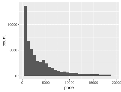
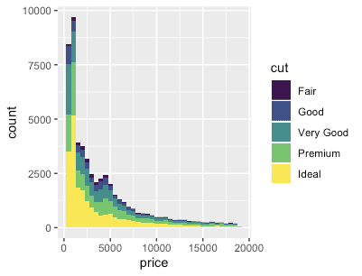
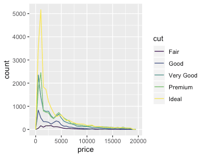
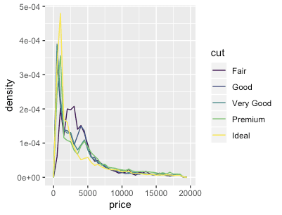
dd <- diamonds %>% data.table
dd %>% ggplot(aes(x=price)) + geom_histogram()

dd %>% ggplot(aes(x=price, fill=cut)) + geom_histogram(binwidth=500)

# stacking histograms보다는 frequency polygons이 비교하기 더 쉽다.
dd %>% ggplot(aes(x=price,              color=cut)) + geom_freqpoly(binwidth=500)
dd %>% ggplot(aes(x=price, y=..count.., color=cut)) + geom_freqpoly(binwidth=500)

# To make it easier to compare distributions with very different counts,
# put density on the y axis instead of the default count
dd %>% ggplot(aes(x=price, y=stat(density), color=cut)) + geom_freqpoly(binwidth=500)
dd %>% ggplot(aes(x=price, y=..density..,   color=cut)) + geom_freqpoly(binwidth=500)
pacman::p_load("ggplot2movies")
dd <- movies %>% data.table()
  # Often we don't want the height of the bar to represent the
  # count of observations, but the sum of some other variable.
  # For example, the following plot shows the number of movies
  # in each rating.
dd %>% ggplot(aes(rating)) + geom_histogram(binwidth=0.1)

  # If, however, we want to see the number of votes cast in each
  # category, we need to weight by the votes variable
dd %>% ggplot(aes(rating)) + geom_histogram(aes(weight=votes), binwidth=0.1) + ylab("votes")

  # For transformed scales, binwidth applies to the transformed data.
  # The bins have constant width on the transformed scale.
dd %>% ggplot(aes(rating)) + geom_histogram(binwidth=0.1) + scale_x_log10()
dd %>% ggplot(aes(rating)) + geom_histogram(binwidth=0.05) + scale_x_log10()

  # For transformed coordinate systems, the binwidth applies to the
  # raw data. The bins have constant width on the original scale.

  # Using log scales does not work here, because the first
  # bar is anchored at zero, and so when transformed becomes negative
  # infinity. This is not a problem when transforming the scales, because
  # no observations have 0 ratings.
dd %>% ggplot(aes(rating)) + geom_histogram(boundary=0) + coord_trans(x="log10")
# Use boundary = 0, to make sure we don't take sqrt of negative values
dd %>% ggplot(aes(rating)) + geom_histogram(boundary=0) + coord_trans(x = "sqrt")

  # You can also transform the y axis.  Remember that the base of the bars
  # has value 0, so log transformations are not appropriate
dd %>% ggplot(aes(rating)) + geom_histogram(binwidth = 0.5) + scale_y_sqrt()
# You can specify a function for calculating binwidth, which is
# particularly useful when faceting along variables with
# different ranges because the function will be called once per facet
dd <- as.data.table(mtcars)
dd <- dd %>% melt.data.table(id.vars=dd$rownames)
dd %>% ggplot(aes(value)) + geom_histogram(binwidth=function(x) 2*IQR(x)/(length(x)^(1/3))) +
  facet_wrap(~variable, scales='free_x')
Hist
set.seed(666)
xvar <- rnorm(n=1000, mean=5, sd=3)
histinfo <- hist(xvar)
histinfo %>% print()

# xvar의 갯수
histinfo$counts %>% sum() # 1000
$breaks
 [1] -4 -2  0  2  4  6  8 10 12 14 16
$counts
 [1]   7  34  95 194 295 209 123  32  10   1
$density
 [1] 0.0035 0.0170 0.0475 0.0970 0.1475 0.1045 0.0615 0.0160 0.0050 0.0005
$mids
 [1] -3 -1  1  3  5  7  9 11 13 15

$xname
[1] "xvar"
$equidist
[1] TRUE
attr(,"class")
[1] "histogram"
xvar <- rnorm(n=1000, mean=5, sd=3)
# BIN ---------------------------------------------------------------------
# bins 갯수
# bins는 (breakup하는 R내부로직이기 때문에)정확하게 breaks와 일치하진 않는다.
h3 <- hist(xvar, breaks=3)
h4 <- hist(xvar, breaks=4)
h5 <- hist(xvar, breaks=5)
h6 <- hist(xvar, breaks=6)

h3$breaks %>% length() # 4+1
h3$counts %>% length() # 4

h6$breaks %>% length() # 4+1
h6$counts %>% length() # 4

#정확하게 원하는 바대로 breaks하려면
xvar %>% hist(breaks=c(-6,-3,0,5,6,16))
xvar %>% hist(breaks=seq(-6,16,by=1))

# bins = 30`. Pick better value with `binwidth`.
# Freq, Density (freq=F)-----------------------------------------------------------
각 bin의 데이터포인트, 확인밀도
xvar %>% hist()
xvar %>% hist(freq=F)

> xvar %>% hist(breaks=seq(-6,14,by=1))
> hh <- xvar %>% hist(breaks=seq(-6,14,by=1))
> hh$density %>% sum()
[1] 1

> xvar %>% hist(breaks=seq(-6,14,by=2))
> hh <- xvar %>% hist(breaks=seq(-6,14,by=2))
> hh$density %>% sum()
[1] 0.5
> (hh$density * diff(hh$breaks)) %>% sum()
[1] 1
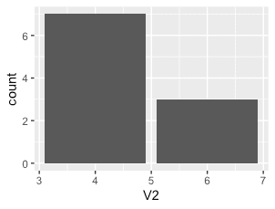
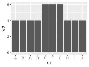
geom_bar
stat = "count" vs "identity"
dd <- data.table(rn=LETTERS[1:10], mpg$cyl[1:10])
#     rn V2
#  1:  A  4
#  2:  B  4
#  3:  C  4
#  4:  D  4
#  5:  E  6
#  6:  F  6
#  7:  G  6
#  8:  H  4
#  9:  I  4
# 10:  J  4
dd %>% ggplot(aes(V2))     + geom_bar(stat='count')
dd %>% ggplot(aes(rn, V2)) + geom_bar(stat='identity')  # 'summary'
| Histogram | Bar graph (stat = "count") | Bar graph (stat = "identity") | |
| type of data | 연속형 (numerical data) int, number | 이산형 (categorical data) factor | Frequency Table |
| X | X | X, Y | |
| indicate | 분포 | 비교 | 표시 |
| elements | 범위에 따라 grouping | 각 bin를 이룬다. | 각 bin는 y값 |
| reorder | 불가능 | 가능 | 가능 |
| bar width | 같을 필요없다. | 항상 같다. | 항상 같다. |
ggarrange(
\tddtrain %>%
\t\tggplot(aes(x=is_featured_sku)) +
\t\t\tgeom_bar() +
\t\t\tgeom_text(stat='count', aes(label=..count..), vjust=-0.2) +
\t\t\tylim(0, 150000)
\t,
\tddtrain %>%
\t\tggplot(aes(x=is_display_sku)) +
\t\t  geom_bar() +
\t\t\tgeom_text(stat='count', aes(label=..count..), vjust=-0.2) +
\t\t\tylim(0, 150000)
\t,
\tddtrain[ , mean(units_sold), by=.(is_featured_sku)] %>%
\t\tggplot(aes(x=is_featured_sku, y=V1)) +
\t\t\tgeom_bar(stat='identity') +
\t\t\tgeom_text(aes(label=round(V1,1)), vjust=-0.2) +
\t\t\tylab("Mean of units_sold")+
\t\t\tylim(0, 120)
\t,
\tddtrain[ , mean(units_sold), by=.(is_display_sku)] %>%
\t\tggplot(aes(x=is_display_sku, y=V1)) +
\t\t\tgeom_bar(stat='identity') +
\t\t\tgeom_text(aes(label=round(V1,1)), vjust=-0.2) +
\t\t\tylab("Mean of units_sold")+
\t\t\tylim(0, 120)
\t, ncol=2
) 