8.0
시퀀스 데이터(문장=>글,음표=>음악, 붓의획=>그림 생성)를 생성하는 방법
LSTM모델, input : n개의 character, output: 하나의 character
이전 token을 input받아서 sequence의 다음 token을 예측하는 rnn모델…
(the cat is on the ma) %>% languageModel(from=latentSpace) = t
우선, output data 선택방법 결정
- 결정적 방법: 결과가 하나로 정해지는 것 (결과가 예측가능한 것)
Input Data에 대한 다음 단어 선택시, 가장 확률이 높은 단어를 선택하는 모델
결정적인 방법을 선택하게 된다면 항상 같은 문장을 생성하고 결과를 확인하는 Model이 Training될 것이다. - 확률적 방법: 결과가 확률에 따라 정해진다는 것
Input Data에 대한 다음 단어 선택 시, 확률에 따라 단어를 선택하는 모델.
확률적인 방법으로서 Model을 Training하게 된다면 주어진 문장 외에도 다양한 학습을 하고 결과를 도출할 것이라고 예상할 수 있다.
#source('/home/sixx_skcc/RCODE/00.global_dl.R')
source(file.path(getwd(),"../00.global_dl.R"))
# https://wjddyd66.github.io/keras/Keras(6)/
# 1D array(original_distribution) & 모든 원소의 합이 1인 parameter를 입력받아(softmax사용) 특정값 출력하는 함수
reweight_distribution <- function(original_distribution, temperature=.5){
\t# original_distribution=example; temperature=.5
distribution <- log(original_distribution)/temperature
distribution <- exp(distribution)
return(distribution/sum(distribution))
}
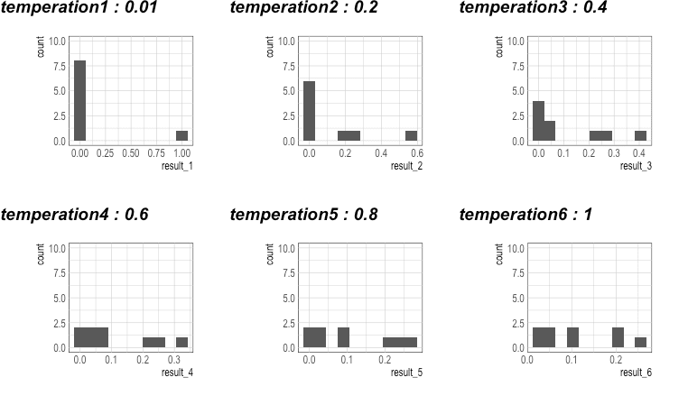
# temperature에 따라 원소의 분포의 변화를 시각화.
# 결과 : temperature가 높아질수록, Entropy가 높아진다 (값의 다양성이 증가)
# 각 원소의 합이 1 인 1D Array 선언
example = c(0.05, 0.05, 0.2, 0.1, 0.1, 0.25, 0.02, 0.02, 0.21)
myTemperature <- seq(0, 1, 0.2) # c(0.01, 0.2, 0.4, 0.6, 0.8, 1.0)
for(i in 1:6){ #i=1
\tif(myTemperature[i] <= 0) myTemperature[i] <- 0.01
\tmyEquation <- glue("result_{i} = reweight_distribution(example, myTemperature[i])")
\teval(parse(text=myEquation))
\tmyPlot <- glue("p{i} <- as.data.table(result_{i}) %>% ggplot(aes(x=result_{i})) + geom_histogram(bins=10) + scale_y_continuous(limits = c(0, 10))")
\teval(parse(text=myPlot))
}
ggarrange(p1,p2,p3,p4,p5,p6, nrow=2,
\t\t labels=str_c("temperation",1:6," : ",myTemperature))
# 위에서 선언한 Array를 위에서 선언한 Temperature을 변화시키면서 확인
# result_1 = reweight_distribution(example, temperature=0.01)
# result_2 = reweight_distribution(example, temperature=0.2)
# result_3 = reweight_distribution(example, temperature=0.4)
# result_4 = reweight_distribution(example, temperature=0.6)
# result_5 = reweight_distribution(example, temperature=0.8)
# result_6 = reweight_distribution(example, temperature=1.0)
# 위에서 각각의 Temperature의 결과를 시각화하여 알아본다.
# p1 <- as.data.table(result_1) %>% ggplot(aes(x=result_1)) + geom_histogram(bins=10) + scale_y_continuous(limits = c(0, 10))
# p2 <- as.data.table(result_2) %>% ggplot(aes(x=result_2)) + geom_histogram(bins=10) + scale_y_continuous(limits = c(0, 10))
# p3 <- as.data.table(result_3) %>% ggplot(aes(x=result_3)) + geom_histogram(bins=10) + scale_y_continuous(limits = c(0, 10))
# p4 <- as.data.table(result_4) %>% ggplot(aes(x=result_4)) + geom_histogram(bins=10) + scale_y_continuous(limits = c(0, 10))
# p5 <- as.data.table(result_5) %>% ggplot(aes(x=result_5)) + geom_histogram(bins=10) + scale_y_continuous(limits = c(0, 10))
# p6 <- as.data.table(result_6) %>% ggplot(aes(x=result_6)) + geom_histogram(bins=10) + scale_y_continuous(limits = c(0, 10))