correlation plot
ggpairs() vs. 함수활용 scatterPlot
library(corrplot)
library(RColorBrewer)
mtcars %>% cor() %>%
corrplot(
type="upper",
order="hclust",
col=brewer.pal(n=8, name="RdYlBu")
)
ddtrain %>% plot()
ddtrain %>% corrplot(method="number")
ddtrain[ , c(5,6, 9)] %>% cor() %>%
corrplot(
main = "correlation", # Main title
col=brewer.pal(n=10, name="RdYlBu")
)
ddtrain[ , c(5,6, 9)] %>% cor() %>%
corrplot(
type="upper", order="hclust",
col=brewer.pal(n=8, name="RdYlBu"),
is.corr = FALSE,
method = "square"
)
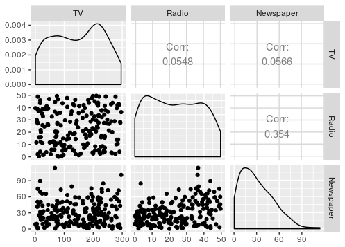
#install.packages("PerformanceAnalytics")
library(PerformanceAnalytics)
ddtrain[ , c(1,5,6,9)] %>% cor() %>% chart.Correlation(histogram = TRUE, method = "pearson")
data <- iris[, 1:4] # Numerical variables
library(tidyverse)
library(PerformanceAnalytics)
data %>%
chart.Correlation(
method = "pearson",
histogram = TRUE
)
palette = colorRampPalette(c("green", "white", "red"))
data %>% cor() %>%
heatmap()
library(corrplot)
library(RColorBrewer)
mtcars %>% cor() %>%
corrplot(type="upper", order="hclust",
col=brewer.pal(n=8, name="RdYlBu"))
https://stat.ethz.ch/R-manual/R-devel/library/graphics/html/pairs.html
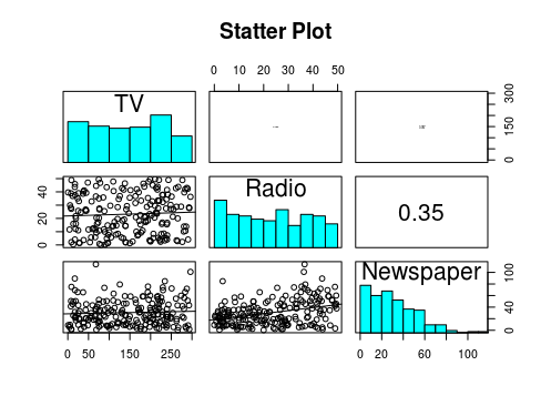
DATA
Advertising <- read.table("http://www-bcf.usc.edu/~gareth/ISL/Advertising.csv",
                           header=T, sep=",")
ggpairs()
library(GGally)

ggpairs(Advertising[, c(2:4)])
함수활용 scatterPlot
# scatter plot matrix
# put histograms on the diagonal
panel.hist <- function(x, ...) {
    usr <- par("usr"); on.exit(par(usr))
    par(usr = c(usr[1:2], 0, 1.5) )
    h <- hist(x, plot = FALSE)
    breaks <- h$breaks; nB <- length(breaks)
    y <- h$counts; y <- y/max(y)
    rect(breaks[-nB], 0, breaks[-1], y, col = "cyan", ...)
}
# put (absolute) correlations on the upper panels,
# with size proportional to the correlations.
panel.cor <- function(x, y, digits = 2, prefix = "", cex.cor, ...) {
    usr <- par("usr"); on.exit(par(usr))
    par(usr = c(0, 1, 0, 1))
    r <- abs(cor(x, y))
    txt <- format(c(r, 0.123456789), digits = digits)[1]
    txt <- paste0(prefix, txt)
    if(missing(cex.cor)) cex.cor <- 0.8/strwidth(txt)
    text(0.5, 0.5, txt, cex = cex.cor * r)
}
# put linear regression line on the scatter plot
panel.lm <- function(x, y, col=par("col"), bg=NA, pch=par("pch"),
                     cex=1, col.smooth="black", ...) {
    points(x, y, pch=pch, col=col, bg=bg, cex=cex)
    abline(stats::lm(y~x), col=col.smooth, ...)
}
pairs(Advertising[, c(2:4)],
       pch = 21,
       lower.panel = panel.lm,   # adding line
       upper.panel = panel.cor,  # adding correlation coefficients
       diag.panel  = panel.hist, # adding histogra
       main = "Statter Plot")