Bar Chart
import pandas as pd
import numpy as np
import plotly.express as px
import plotly.graph_objects as go
#from sklearn.preprocessing import MinMaxScaler

url = 'https://raw.githubusercontent.com/sixxchung/pythondash/6236fbca647de6562c5685de724a08362bd1afea/data/Sales%20data/Data.csv'
df_o = pd.read_csv(url)
df = df_o.copy()
df['year']=df['OrderDate'].str.slice(0,4)
df['month']=df['OrderDate'].str.slice(5,7)
df = df.sort_values(by=['Region', 'Channel', 'Category', 'Item Type', 'year', 'month', 'Gender' ])
df.info()

d20 = df[ df.year=='2020'].copy()
d20['Margin'] = d20['Revenue'] - d20['Cost']

df_g0 = d20.loc[:, ['Country', 'Revenue', 'Margin']]
df_g = df_g0.groupby(by=['Country'], as_index=False).sum()
df_g = df_g.sort_values(by=['Revenue'], ascending=False)
df_g['rank'] = list(range(1, len(df_g['Country'])+1))

df_g1 = df_g[ df_g['rank']<=10]
df_g1 = df_g1.reset_index(drop=True)
sigle
https://plotly.com/python/bar-charts/
import pandas as pd
import numpy as np
import plotly.express as px
import plotly.graph_objects as go
from sklearn.preprocessing import MinMaxScaler
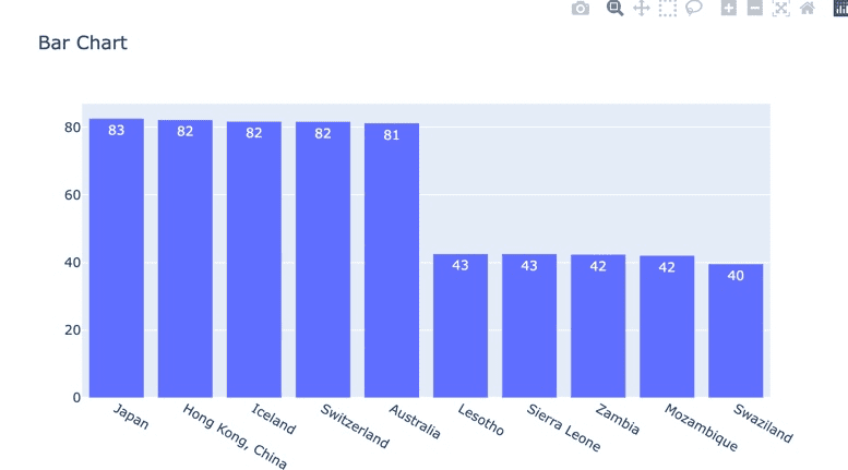
gapminder = px.data.gapminder()
d2007 = ggminder[ggminder.year == 2007].copy()
d2007 = d2007.sort_values(by=['lifeExp'], ascending=False)
d2007['rank'] = list(range(1, len(d2007.country)+1))
df = pd.concat([d2007.loc[d2007['rank'].isin(range(1, 6))],
d2007.loc[d2007['rank'].isin(range(138, 143))]])
trace1 = go.Bar(x=df.country, y=df.lifeExp,
                text=round(df.lifeExp, 0))
layout = go.Layout(title="Bar Chart")
fig = go.Figure([trace1], layout)
fig.show()
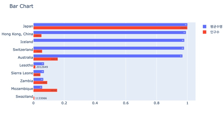
Multi
scaler = MinMaxScaler()
scaler.fit(df[['lifeExp', 'pop']])
df[['zlifeExp', 'zpop']] = scaler.transform(df[['lifeExp', 'pop']])
x축 y축 바꾸고, orientation ='h'
trace1 = go.Bar(x=df['zlifeExp'], y=df['country'],
            text=round(df.lifeExp, 0), name='평균수명',
            orientation='h'
        )
trace2 = go.Bar(x=df['zpop'], y=df['country'],
            text=df['pop'], name = '인구수',
            orientation='h'
        )
layout = go.Layout(title="Bar Chart",
            # barmode='group', #stack
            yaxis=dict(autorange='reversed')
        )
fig = go.Figure([trace1, trace2], layout)
fig.show()